BRAND GUIDELINES

SEC. 1 — Overview
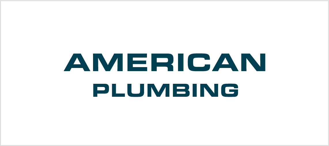
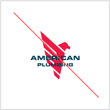
Next SectionLogo - Lockup
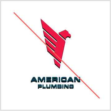
The only acceptable versions of the American Plumbing logo lockup are pictured here. The logo lockup may not be reconstructed or altered in any way. It must be reproduced from reproduction-quality art or from high-resolution digital files.
SEC. 2 — Brand Essence
Next SectionBrand Tone
Good brands on built on consistency. The words identitified to the right are the three brand tenants that should guide all communication and messaging efforts.

SEC. 3 — Visual Identity
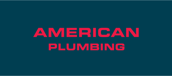
Next SectionLogo Lockup — Primary
A logo lockup is a combination of the logo icon and the wordmark. The primary logo lockup may not be reconstructed or altered in any way. It must be reproduced from reproduction-quality art or from high resolution digital files.
Shown here is the primary lockup. This version is to be used when ever possible. If this version is not appilicable to the design scenario, please use the alternate version(s) below.
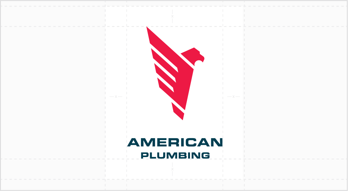
Logo Icon
A logo icon is the main graphic element of the visual identity. The logo icon may not be reconstructed or altered in any way. It must be reproduced from reproduction-quality art or from high resolution digital files.
If you are in need of a one color version of the logo, please contact American Plumbing.
Logo Wordmark
A logo workmark is the part of the logo consisting of typography. The workmark may not be reconstructed or altered in any way. It must be reproduced from reproduction-quality art or from high resolution digital files.
Although the workmark has been designed using the primary typeface Eurostile Extended, the wordmark should never simply be typed out using that font.
SEC. 4 — Identity Usage
Next SectionWhitespace — Logo
Each aspect of the identity must be treated properly as it is applied to design. Pictured right are the guidlines for whitespace when utalizing the logo lockup.
The space surrunding the logo lockup should never be smaller than the height or width of X. X is equal to the height of the wordmark in the logo lockup.
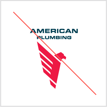
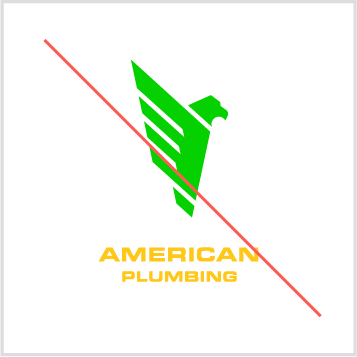
Misuses
The American Plumbing logo should always be used in its original format or under the guidelines given. Never should logo be treated in one of the methods shown here.
Embellishing
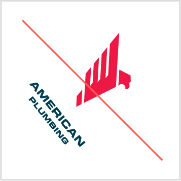
Rotating
Altering Proportions
Non-Designated Colors
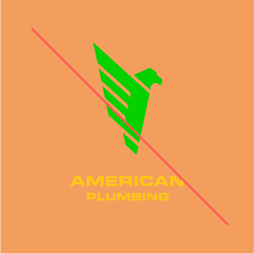
Non-Designated Colors
Reordering Elements
Distort or Skew
Adding Stroke
Layering Elements
SEC. 5 — Brand Elements
Next SectionPattern
The pattern for the American Plumbing brand features the logo icon repeated at a very dynamic angle. The pattern should be used sparingly and alway in supplement to the other brand assets.

SEC. 6 — Typography & Color
Typography — Primary
News Gothic
Shown here is the primary typeface for American Plumbing. Utalization includes subtitles, body copy, general use, and annotations.
The only acceptable wieght for News Gothic is medium and bold.
Tt
A Quick Brown Fox
Jumped Over A Lazy Dog.
ABCDEFGHIJKLMNOPQRSTUVWXYZ
abcdefghijklmnopqrstuvwxyz
1234567890! @#$%^&*()_+
Color Palette
Shown here is the main color palette for the American Plumbing brand.
The colors should never be used outside of the values shown here. When utalizing a logo file, check to make sure that the color profile is appropriate given the usage. The following shows each color profile’s appropriate use:
- Pantone: Offset Spot Printing, Screen Printing
- CMYK: Offset Process Printing, Digital Printing
- HEX: Screen-Based Applications
- RGB: Screen-Based Appilcations